Dill & Dash
Dill and Dash believe that bold flavors should accompany life’s adventures. Located in the heart of Holland, Michigan, Dill and Dash’s goal is to revolutionize how people enjoy spicy pickles on the move. We cater to every pickle lover with various heat levels, from mild to fiery hot.


The Process
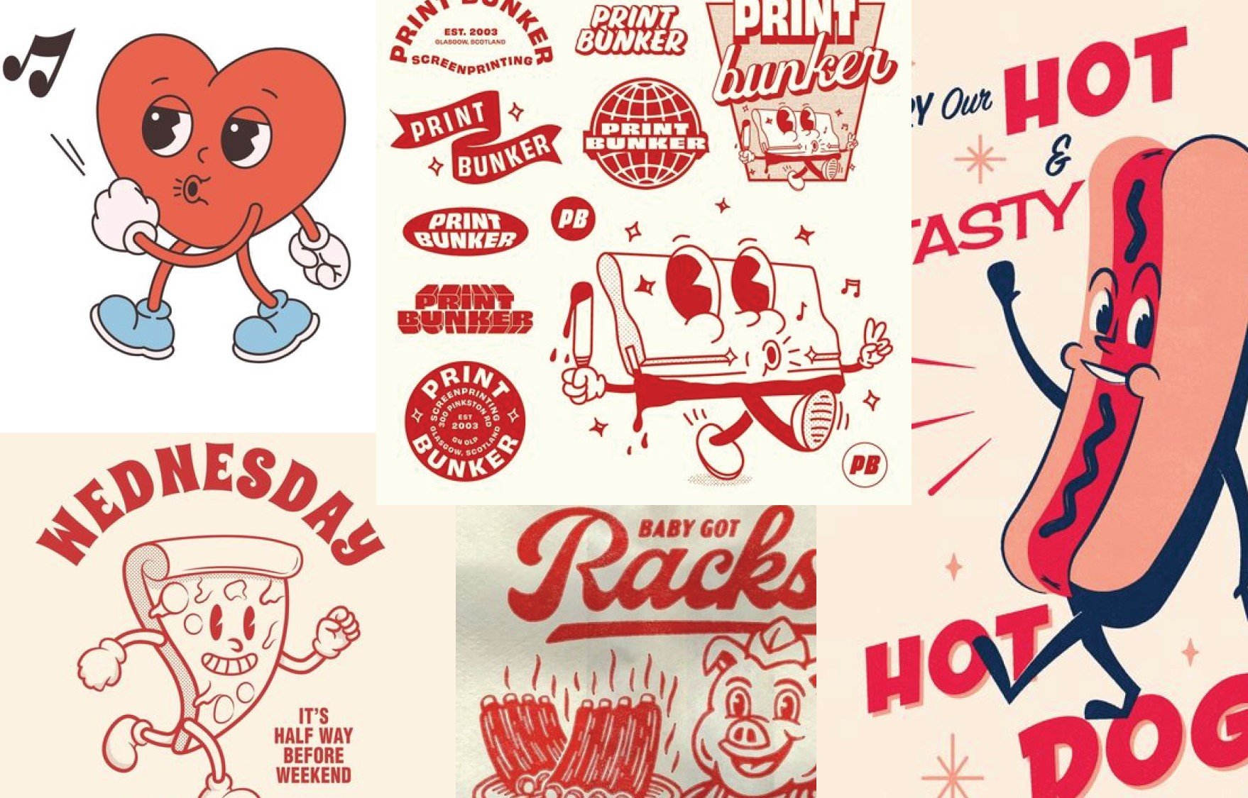
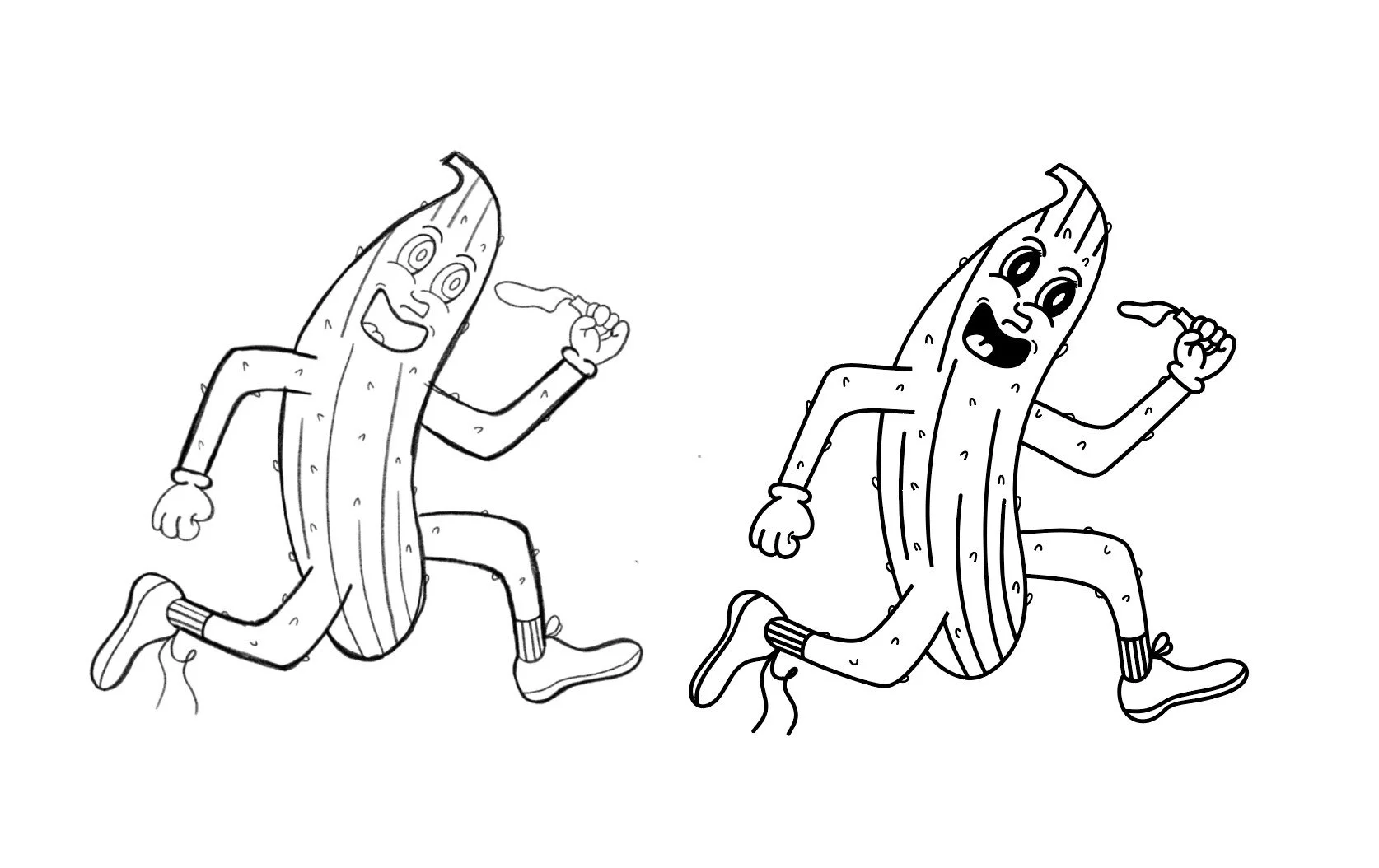
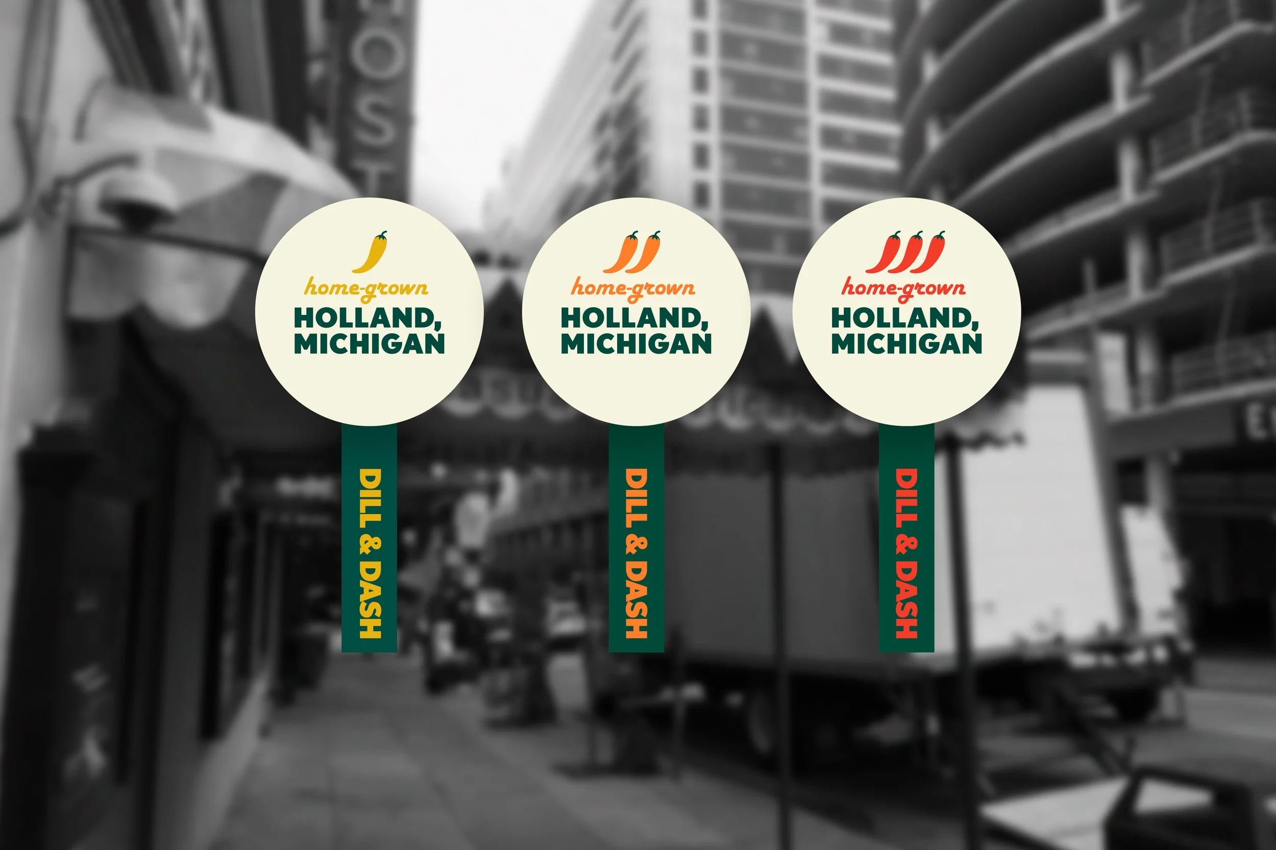
The Dill & Dash logo is designed to showcase a sense of upbeat and fast-paced elements. The concept of the design behind the logo connects the product of the spicy pickles and the audience's movement. Elements from the 1950s, such as the cartoon illustration, played a part in the established date of the brand. Within each variety of spice levels, the corresponding color changes within the official mark.
The colors used are the main part of the Dill and Dash logo. The dark green represents the boldness of pickles as well as the light green that brightens up the traditional pickle color. The light tan represents the 1950s muted accents. The variety of spice levels are seen within the mustard yellow for mild, bright orange for medium, and dark red for hot.
Dill and Dash branding contains a patterned design on all forms of packaging. The checkered pattern connects to the 1950s and the sense of speed like a racing flag. Each pattern reflects the variety of spice levels as well as the main pattern for the brand. A dark green pattern is the main design for the brand, while yellow is for mild, orange is for medium, and red is for hot.
Within Dill and Dash, specific typography is used. For the main log,o Nobel and Harlow Solid Italic are used to connect to the 1950s elements as well as movement through a bold sans serif. Publications for advertising, social platforms, and websites use Nobel to connect to the logo while also incorporating the entire font family.
Dill and Dash received 1st place in the Annual Juried Show at York College of PA in 2025. The jurors were Jacob DeGeal and Lauren Smedley.